
956 Charro
956 Charro (gouache, 8X8)
I’ll let you in on a little secret: I find painting to be challenging. Though I studied it for many years, merging multiple disciplines (color theory, values, color temperature, medium nuances, etc.) is incredibly difficult. Good painters are excellent for a reason.
Sometimes, people are more natural at it than others. But, all need practice. No tree produces fruit without nourishment over time!
I always gravitated toward graphite drawings. I found safety in drawing black and white hyperrealism. But I grew stale over years of compounding, what felt like, the same drawing over and over again.
During the pandemic, I made a choice to relearn and repractice color theory. I knew I wanted to work within limitations:
Paint small paintings: to force me to paint the big picture and not get stuck in details.
Post everything I paint: to get over my struggle with perfectionism.
This resulted in painting being a joyful learning experience. It has opened up new doors to exploration. And the fact that I have gotten to do this alongside my family has been an incredible blessing.
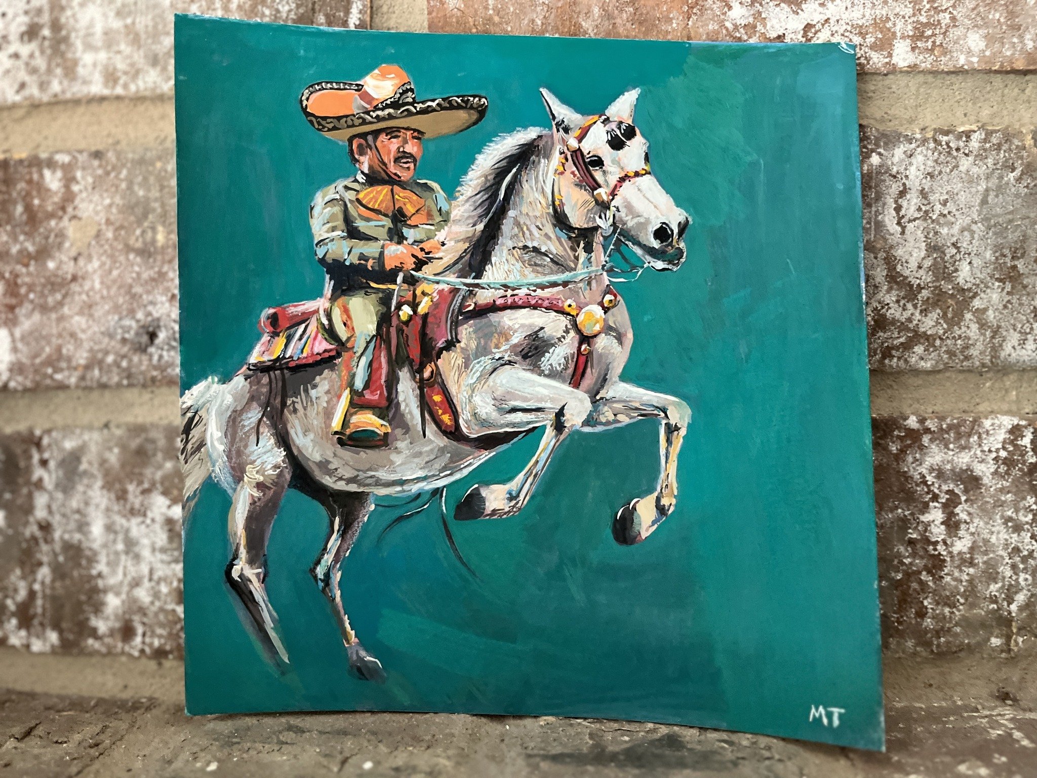
With that, here are a few snippets of my process behind my gouache 8X8 of 956 Charro.

First, I had this idea of painting something from Brownsville’s Charro Days. This annual celebration is too good not to represent in paint form. Everything from the colors, dress, decor, and food spark local unity between Brownsville and Matamoros.
I asked my friend, Daniela Loera Gonzalez (owner of Border Creative Co.), if I could paint her wonderful photo of this charro. She was gracious enough to grant permission.

I didn’t really know the direction this would go but I first needed to get values on after my initial sketch. I call this the “poo-poo” phase. As you can see…it looks as such. For all the years I’ve been an artist, this is the phase I call it quits on a piece. It is easy to understand why!
The poo-poo phase lasts, for me, about 60-70% of the painting process. This is why art-making takes resilience. You’ve got to push through the poop.

There we go. This is looking a little better. I still felt the colors needed some harmony. In Daniela’s photo, I love how those reds pop out from the horse’s straps and saddle as well as its textured fur. Time to bust out my handy color mixing guide…

In order to make the reds pop, I painted the background a blue-green color. Let’s see what that does.

There we have it. After that 60-70% hump, its time for some details. And there you have it. Now, let’s keep practicing!